What to Put on a Thank-You Page: The Confirmation Page as a Show-Rate Tool
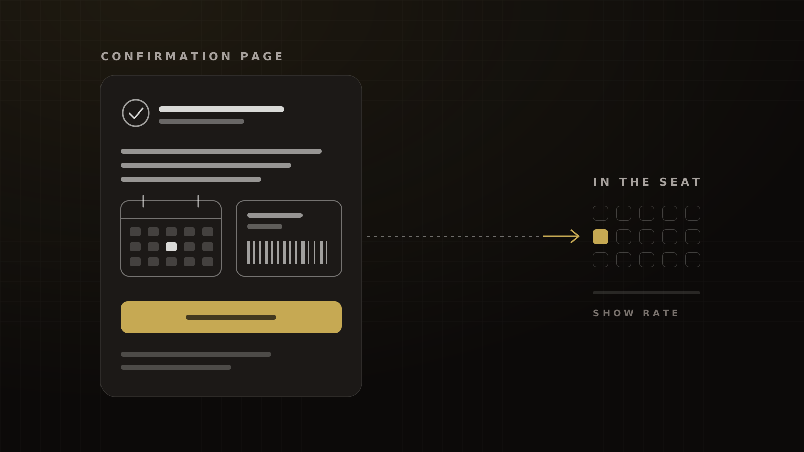
The page people see right after they register is your first show-rate lever. The nine components we put on it, and what each one does for attendance.
 Ray GillespieCo-Founder & COO
Published 9 min read
On this page
Key takeaways
- The confirmation page is where attendance starts, not a formality. In our experience a free one-day event shows 35% to 45% of registrants when it's run well, and a confirmation page with full details is one of the conditions.
- Lead with the essentials: date, time with time zone, place or join link, and a one-tap add-to-calendar button.
- For in-person events, add a Wallet pass. Google Wallet notifies the user three hours before a saved event starts.[1]
- Give one next step at a time. The VIP upgrade belongs here, below the details, because it adds no friction to the registration.
- Fire CompleteRegistration once, on this page, and deduplicate it with the Conversions API.[2]
Most confirmation pages say "You're registered" and stop. That page is the first thing a new registrant sees, and it's the cheapest show-rate lever in the funnel.
Use it to make showing up easy and specific: the exact time, a calendar entry, a Wallet pass, a reason to come, and one clear next step. Then use it to earn money and data without costing a single registration.
The short answer: the confirmation page is where attendance starts
In our experience, a free one-day in-person event shows 35% to 45% of registrants when it's run optimally. "Optimally" has three conditions: a short promotion window, a steady reminder cadence and a confirmation page with full details. One of the three is this page.
Webinars follow the same logic with different numbers. On the funnels we run, a cold-traffic evening webinar shows 25% to 35% of registrants live, and a free webinar to a warm house list shows 40% to 50%. Livestorm's 2025 average live show-up was 47.7%, mostly B2B and organic registrants.[3] ON24 reports 60%, but that counts on-demand viewers too, so it isn't a live show rate.[4]
None of the "thank you page examples" lists measure a component against attendance. Demio's 2021 guide already recommends join instructions and calendar links.[5] What's missing is which components actually move attendance and revenue, and how strong the evidence is for each. That's what the checklist below grades.
The checklist: 9 components and what each one does
The confirmation page checklist
- Exact date, time with time zone, and the address or join link
- One-tap add to calendar (Google, Apple, Outlook)
- Wallet pass for in-person events (Apple and Google)
- "Check your inbox" with the sender name and subject line
- SMS reminder confirmation, for people who opted in
- A short "why you'll want to be there" video or line
- Invite a friend or colleague, as a share link
- VIP upgrade or order bump, below the details
- The pixel registration event, fired once and deduplicated
1. Exact date, time zone and place or join link
This is the one people skip when a launch is rushed. Put the full date, the start time with the time zone, and the address or join link at the top, in plain text. If the time or venue isn't final, don't launch the page yet.
2. Add to calendar
This has the best evidence behind it, even though it's borrowed. In a randomized field experiment, people prompted to write down the date and time they planned to get a flu shot followed through 4.2 points more often, from a 33.1% baseline. A date-only prompt added 1.5 points, which wasn't significant.[6] A calendar entry is that plan, written for them.
It's a vaccination study, not an event study, so read it as a mechanism. Vendor numbers are weaker. AddEvent reports a customer saw 20% to 30% higher attendance after adopting its calendar tool, with no baselines or method.[7]
3. Wallet pass for in-person events
A Wallet pass is a ticket that reminds people on its own. An Apple Wallet pass can carry a relevant date and up to 10 locations, so it appears on the Lock Screen at the right time and place.[8] Google Wallet event tickets can be issued through web, email or SMS links.[9] Google also notifies the user three hours before a saved ticket's start time, depending on their notification settings.[1]
In our experience, 40% to 55% of registrants add the pass when we offer it on the confirmation page and in the confirmation text and email. The only public reference is a ticketing company where 40% of Android users saved a ticket to Google Wallet.[10] That's a save rate, not a show rate. Neither Apple nor Google publishes attendance data.
The pass also gives you a signal. If someone doesn't add it, that's a reason to follow up before the event.
4. "Check your inbox"
Tell people exactly what's coming: the sender name, the subject line and when it arrives. Ask them to move it to their main inbox if it lands elsewhere.
Inbox placement is not a given. Validity's seed-list data put global inbox placement at 87.2% in 2025, so about one in eight emails missed the inbox.[11] On the domains we manage, our target after remediation is 90% or more on pre-send seed tests. Gmail's bulk-sender rules, including SPF, DKIM, DMARC and one-click unsubscribe, are the floor.[12]
5. SMS reminder confirmation
If the registrant opted in to texts, confirm it on the page and say when the reminders will come. Text reminders have solid evidence in an adjacent field. A Cochrane review of 7 randomized trials with 5,841 people found SMS reminders improved healthcare appointment attendance, with a risk ratio of 1.14 against no reminder.[13]
Delivery is the catch. After we fixed our event reminder setup, delivery came back at 95% or more, which is now the floor we hold. We found no method-disclosed industry benchmark to compare it to. The fix is in our SMS carrier filtering post-mortem.
6. A reason to show up
Remind them what they get by attending live: the one outcome, the one thing they'll leave with. A 30-second video from the host works well. This is Hormozi's value equation at work: raise the perceived likelihood that showing up pays off, and cut the effort it takes.
7. Invite a friend or colleague
People share far more right after they commit. Eventbrite reported in 2011 that 10% of ticket buyers shared from the confirmation page, against 1% of people browsing the event page, and 60% of Facebook shares happened after purchase.[14] The data is 15 years old and from paid tickets, so treat it as a reason to test, not a forecast. Use a share link the registrant sends themselves, rather than a form that messages people on their behalf.
8. VIP upgrade or order bump
This is the one place an offer costs you nothing in registrations, because the person has already said yes. In our experience 5% to 12% of free registrants take a low-priced VIP or replay offer shown right after sign-up, and the bump recovers roughly 40% to 50% of webinar ad spend. There's no public benchmark for this placement; checkout bump rates measure paying buyers, a different denominator. Why the friction belongs after the yes is in where should the friction go.
For live events, the VIP upgrade also lifts attendance. In our experience paid VIP tickets in the $100 to $297 range show 85% to 90%, and we price the tier so VIP revenue covers 100% or more of its own ad spend. The split is in free vs paid event tickets. Put the upgrade below the event details, never above them.
9. The pixel event, fired once
The confirmation page is also your measurement point. Meta's standard events define CompleteRegistration as a completed registration, Schedule as a booked appointment and Purchase as a completed purchase.[15] Fire CompleteRegistration for a free sign-up, once, on this page.
If you also send events from the server, Meta only deduplicates when the event ID and event name match, within 48 hours of the first event. Without matching keys, the registration is counted twice.[2] Clean events teach Meta to find more people who register, so this page earns its place even when nobody reads it.
Calendar button or inbox? Two schools
Jason Fladlien, who teaches webinar selling, takes the opposite view on calendars. He sends registrants to their inbox rather than giving them a one-click calendar button, because he thinks the button makes the action mindless.
We default to the calendar button, and here's when each fits:
- Calendar first for one-off webinars and live events on cold traffic, where the session is the whole game and people don't know you yet.
- Inbox first for a house list, a series or a launch, where the next week of email matters more than one session.
Either way, give one primary action. A page that asks for a calendar save, an inbox check, a share and an upgrade all at once gets none of them. Order them: essentials, calendar or pass, then a single next step.
Teardown: before and after
The page that taught us this belonged to a veteran stage speaker relaunching live events. The original confirmation page just confirmed the sign-up. It had no time, no venue detail and no next step, because the launch went out before the details were final. Turnout was poor, and our CTO's read was that the empty page was a big part of why.
The rebuild followed the checklist above: full details at the top, add to calendar, a Wallet pass, a reason to come, invite a colleague and the VIP upgrade at the bottom. The page also stayed in the funnel because it's where the registration pixel fires.
Mistakes
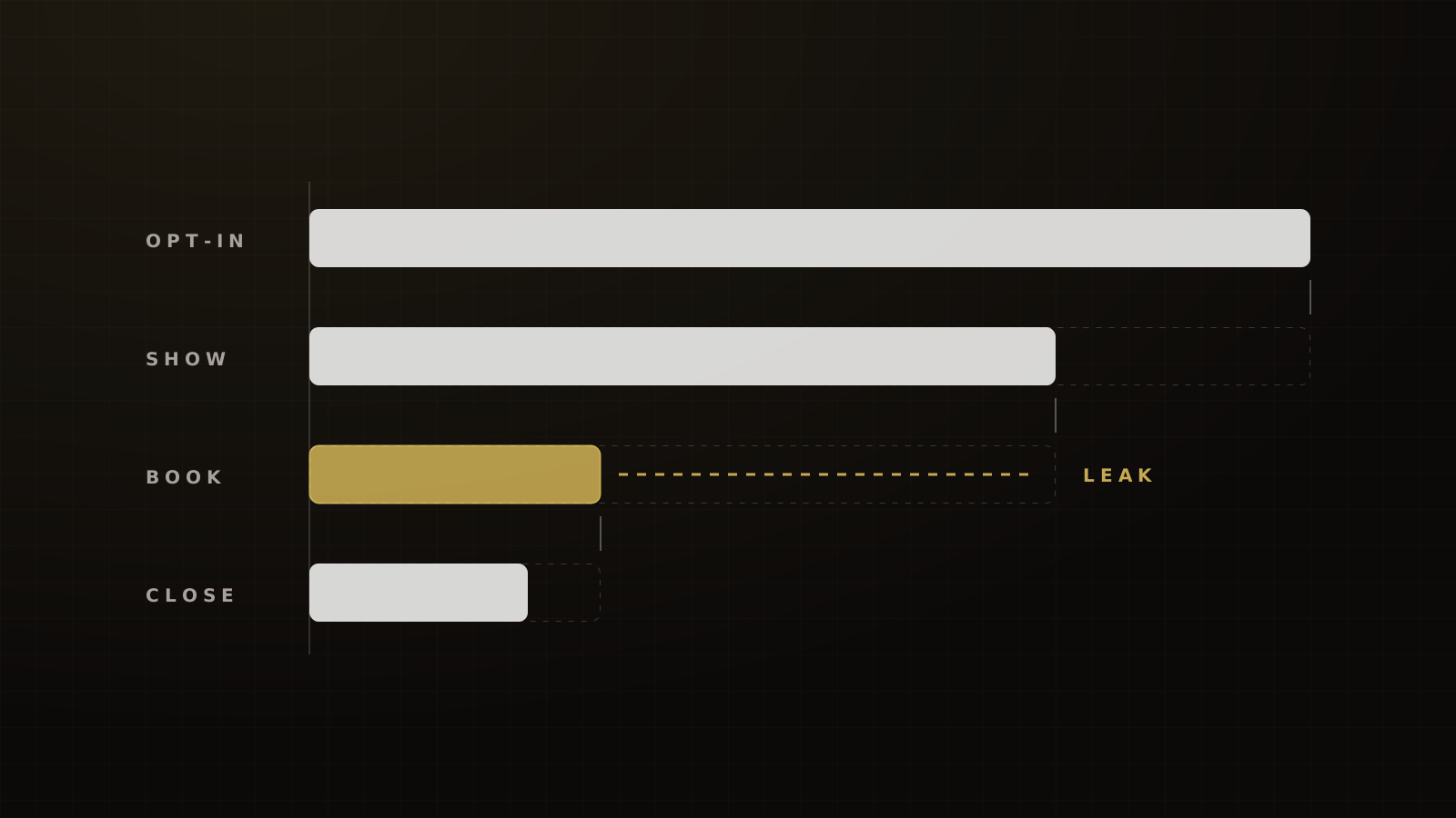
- Launching before the time and venue are set. A confirmation page without details is a show-rate leak you paid to create.
- No time zone. Cold traffic crosses time zones; "7 pm" is not a time.
- Four calls to action. Pick one next step and order the rest.
- Firing Purchase on a free registration. It corrupts the data Meta learns from. Use CompleteRegistration.
- Trusting "calendar savers attend 2x to 3x." We couldn't find a study behind it, and keen people are the ones who click.
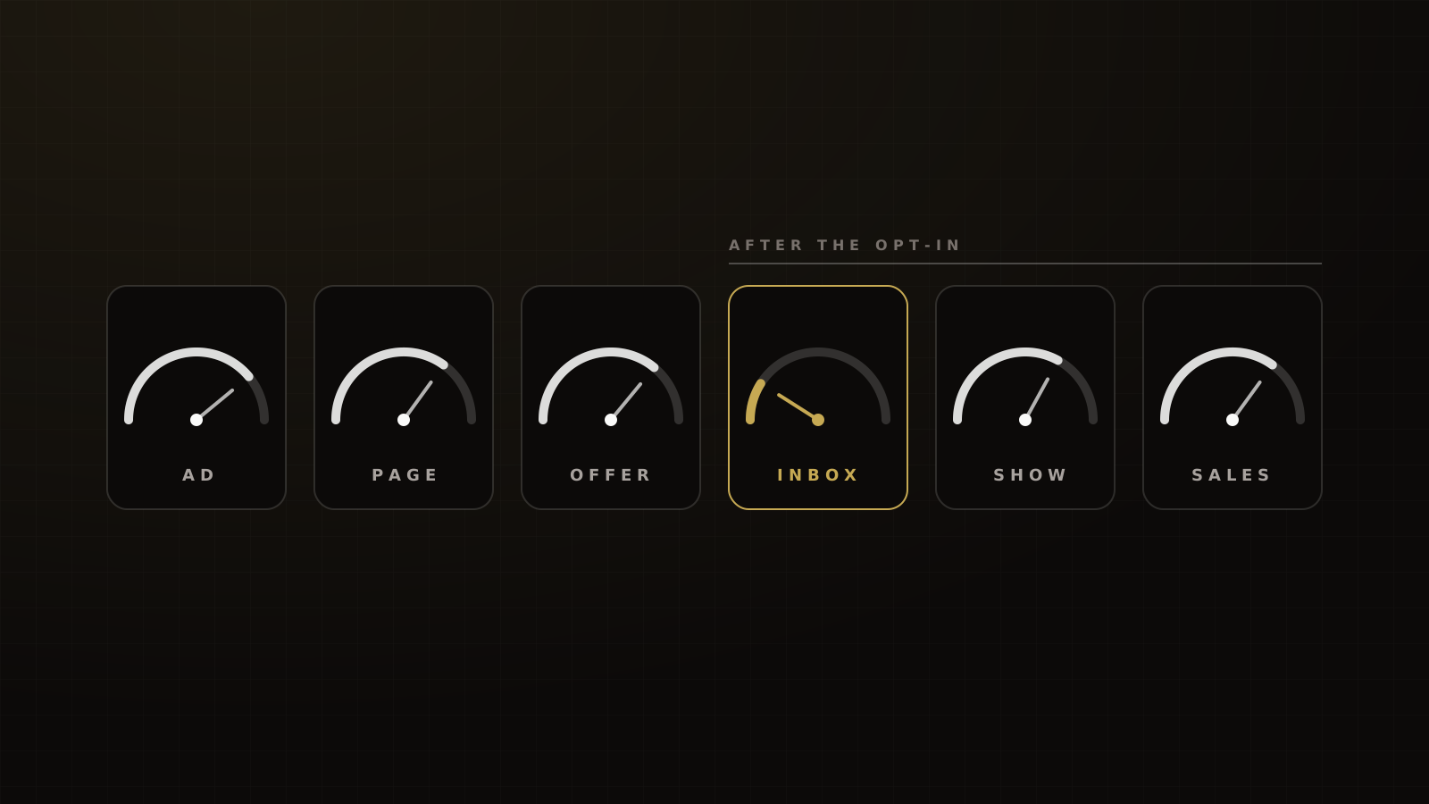
If you're not sure which stage is leaking, the funnel diagnostic walks through each one.
This page is one stage in the funnel. For the benchmarks around it, see our funnel CRO guide and the event marketing and show rates guide. For the page before it, read why we moved cold event traffic to an opt-in first. If you want us to look at your confirmation page, book a strategy call.
Frequently asked questions
Sources
- 1.Trigger push notifications for event tickets. Google for Developers (Google Wallet), 2026-09-28.
- 2.Handling duplicate Pixel and Conversions API events. Meta for Developers, living doc, checked 2026-10-04.
- 3.Webinar Benchmark Report 2026. Livestorm, 2026.
- 4.Webinar guide (2026 webinar benchmarks). ON24, 2026.
- 5.Setting up a post-registration thank-you page. Demio, 2021-05-03.
- 6.Using implementation intentions prompts to enhance influenza vaccination rates. Milkman, Beshears, Choi, Laibson & Madrian, PNAS, 2011.
- 7.BuddyIns boosts virtual attendance rates by 30% with AddEvent's help. AddEvent (vendor case study), 2024-04-18, last reviewed 2026-09-25.
- 8.Showing a pass on the Lock Screen. Apple Developer Documentation (Wallet Passes), living doc, checked 2026-10-04.
- 9.Event tickets (Google Wallet API). Google for Developers, living doc, checked 2026-10-04.
- 10.Oztix case study. Google Wallet, undated.
- 11.2026 Email Deliverability Benchmark Report. Validity, 2026-03.
- 12.Email sender guidelines. Google, Gmail Help, living doc, checked 2026-10-04 (rules effective 2024-02-01).
- 13.Mobile phone messaging reminders for attendance at healthcare appointments. Cochrane (Gurol-Urganci et al.), 2013-12-05.
- 14.Eventbrite unveils industry-first data to quantify the value of social commerce. Eventbrite (press release), 2011-03-22.
- 15.Meta Pixel reference: standard events. Meta for Developers, living doc, checked 2026-10-04.
Written by
Ray GillespieCo-Founder & COO
Ray runs day-to-day operations across every Victory engagement, building the systems, automations and AI-powered workflows that hold the machine together. He has overseen operations behind more than $120M in revenue.
Part of the guide: Funnel CRO: Benchmarks, Diagnostics and Tests for Coaching, Course and Event Funnels